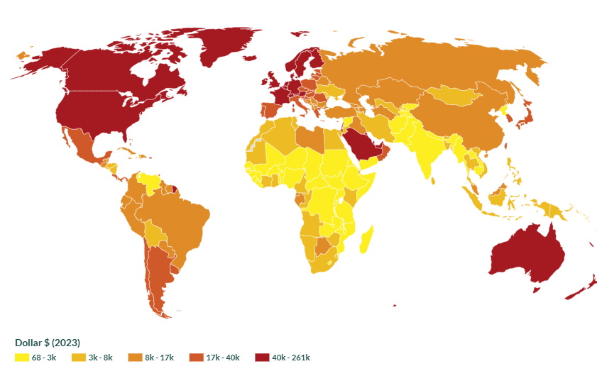
The global distribution of wealth shows that there are some patterns that
generalisations can be made from,
looking at the map that has been
created based off the global distribution of wealth. The different
patterns show
how and where the countries have different income around the world. Based
on the countries
in the northern hemisphere, most very high-income countries
are in the northern hemisphere. There is more
than half of the
low-income countries near each other in Africa, those countries are quite close
together so it would make sense that all those three are low-income.
2nd lowest (medium) income
countries are either in Africa or Asia. Based
on the evidence, global wealth is unevenly distributed. The map highlights
that
most very high-income countries are concentrated in the northern hemisphere, including
regions such as north america,
western europe, and parts of east asia.
The majority of low-income countries are clustered close together in Sub-Saharan
Africa, where more of the half of the world's poorest nations are located.
These countries are geographically close, which makes sense
why they contribute to shared
economic challenges such as limited access to education, healthcare, and infrastructure. Many
medium-income countries are found in parts of Asia and Africa,
reflecting economies that are transitioning but still facing barriers to
wealth growth.
This pattern creates a geographical link to economic statuses, where location and regional
factors influence
a country's income level and opportunities to development.
Now click Alaska.